

A kitchen can have high-end paint, stylish backsplash tile, and expensive hardware, and still feel…off. That slight emotional unease you notice isn’t always about style. It often comes down to layout: misaligned cabinet runs, illogical sightlines, or unbalanced spaces that disrupt flow and harmony.
At Haven & Oak, we prioritize layout from day one, balancing visual rhythm, functional zones, and human movement, so every design element clicks into place. When layout feels intentional, even simple finishes shine.
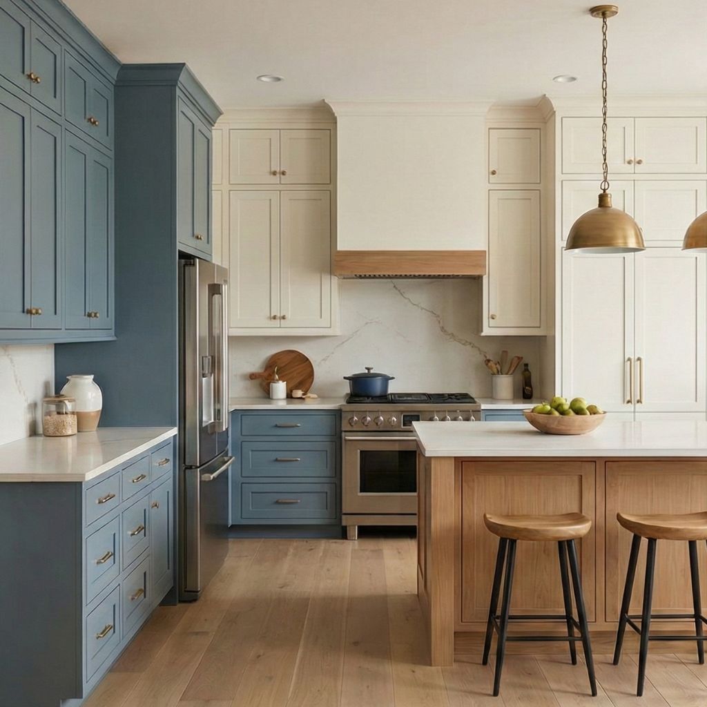
1. When Your Eye Doesn’t Know Where to Land
Pay attention next time you walk into a space and feel something is off. It’s often not one glaring issue, it’s subtle misalignments that your brain senses subconsciously.
- Misaligned uppers: Cabinets that stop mid-wall or ignore nearby elements break visual continuity.
- Inconsistent gaps: Too-narrow or wide spaces between runs create a feeling of visual clutter or imbalance.
- Forced fit runs: Cabinets squeezed in to fill space can feel like puzzle pieces, not part of a cohesive story.
These small mistakes distract the eye and unsettle the flow, even if finishes are well-chosen.
2. Cabinet Layout as a Visual Blueprint
Visual harmony starts with balance and intentional spacing. In layout-first kitchens:
- Eye-level symmetry prevails. Align cuff edges with countertops, carry finishes across contiguous walls, and center major features.
- Anchor points guide the design, like a range hood or sink, creating natural centers and rest stops for the gaze.
- Visual “pauses”, spaces or repeats like floating shelves, balance busy zones and let design breathe.
When composition feels balanced, even tile and paint become more impactful.
3. Classic Layout Tools: Flow + Function
The Work Triangle
Pro designer layouts honor the fridge–sink–stove triangle. It keeps movement efficient and pathways logical. A misaligned cabinet can disrupt that rhythm and impede use .
Zones for Life
- Prep Zone: Needs drawers for utensils and easy-to-clean nearby surfaces.
- Cooking Zone: Cabinets that align with cooktop height, hood symmetry, and ventilation.
- Cleanup Zone: Sinks centered in layout and flanked by balance-providing features like open shelving or dish drawers.
These dedicated zones guide layout placement alongside visual flow .
4. Common Layout Mistakes That Feel “Off”
| Mistake | Why It Feels Off |
| Crisscross traffic patterns | Interrupts flow, creates congestion, uncomfortable to use |
| Islands placed mid-aisle width | Blocks circulation and visual openness |
| Uppers unaligned with counters | Feels disjointed; furniture and appliance tops don’t match height |
| Missing anchor elements | The space lacks a visual “home base” |
These issues break both practical use and subconscious comfort .
5. Designing with Flow in Mind
- Choose anchor elements (hoods, structural columns, windows) and align cabinets symmetrically around them.
- Maintain proper clearance: 42″ for one-cook, 48″ for two-cook kitchens. Island to cabinet spacing is crucial .
- Respect standard module widths: 12″, 15″, 18″ increments prevent forced gap fillers.
- Repeat shapes and finishes: Handles, trims, colors create continuity across zones.
These steps ensure visual and physical flow exist hand in hand.
6. Real-World Fixes That Bring Layout Harmony
- Floating shelves as anchors: Creates balance beside sinks, even when cabinets don’t align.
- Symmetry restoration: Adjust uneven runs by shifting panels or adding trim filler.
- Aligning islands with cabinet runs: Ground open areas and create seamless flow.
- Trim and panel choices: Re-frame cabinets to match hood height or window lines.
Even modest tweaks can restore balance and make the room feel “just right.”
7. Why Finishes Feel Better When Layout Works
Once layout harmony is in place:
- Paint appears richer, because edges and color transitions align.
- Tile and grout flow visually, even matching centerlines across runs.
- Hardware placement stays consistent, reinforcing a sense of thoughtful design.
It’s visual psychology: a cohesive layout feels intentional, raising all style elements.
8. Planning Flow: A Step-by-Step Guide
Here’s how we approach layout-first design:
- Review structural elements, plumbing, load-bearing points, and lighting.
- Map zones: prep, cook, clean, storage, and traffic.
- Select anchor features and align them centrally.
- Arrange cabinet runs in standard increments, ensuring symmetry.
- Build sightlines, center windows and features along visual axes.
- Validate with 3D renderings and walk-through mockups.
- Check sightlines and movement before finalizing.
- Add visual breaks, trim, fillers, or repetition near busier runs.
That order ensures balance and flow.